https://docs.google.com/present/edit?id=0Aei7etLNhVF4ZGd2NXZjcmJfMWN2OGtjaGc2&hl=en&authkey=CKLBy_MB
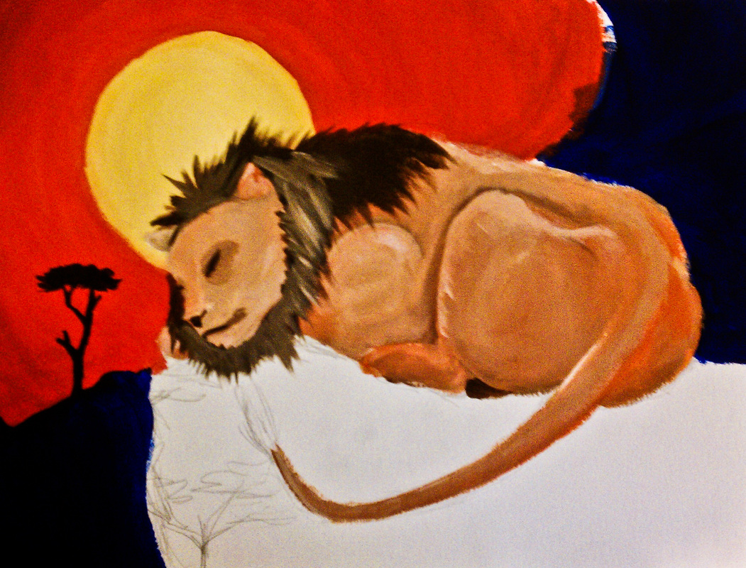
I started this over break, using acrylic. I wanted it to be Africa inspired, and I had a really good idea with skin patterns from different animals, but it didn't work out so well, because I didn't really add it. I think I might change the lion's skin color to something more bold and not so peachy. I also need to finish the bottom, which will have more trees like the one on the left. I didn't want this to be realistic. I wanted to create something kind of abstract, but not too crazy. I kind of hate it right now, but I'm going to finish it this week.
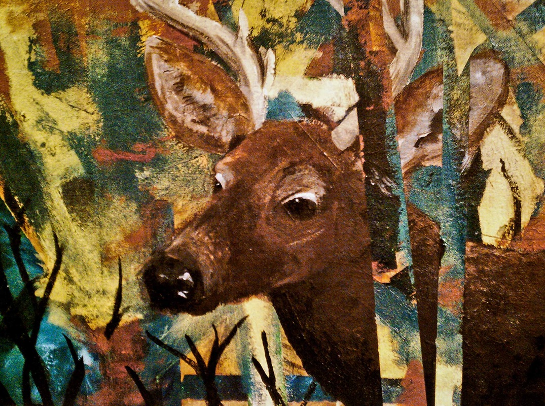
I finished my tape/texture painting, thing. I added a deer and painted over the two strips of tape I had put on before break, so that when I took it off, it would look like the deer was camouflaged in the trees and branches. For some reason, this painting is really bumpy, and has a really weird texture.
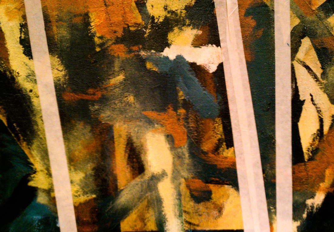
So this is still a WIP, and I finally think I know where I'm going with it.
I painted a layer of sap green first, then put some masking tape over it. Then I painted a teal color with some highlights, put tape on it, then did the same with a golden kind of yellow and then a reddish brown. I took the tape off and there was way too much sap green, and it didn't go well with the rest of my color palet, so I painted teal over the green and then touched up the edges with the reddish brown and yellow.
So that is only the background, but I'm going to add a deer head in the center, and then have its neck and the rest of its body behind some of the other colors, giving the illusion that it's behind some tree branches.
To create space, I started with the darker colors in the back, and then worked my way up to lighter, contrasting colors.
My main goal with this was to play around and experiment with the different textures you can make with acrylic instead of just smoothing it out like oils.
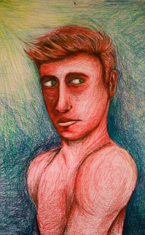
So I started this drawing at the beginning of the semester and just stopped working on it because I had figured out that it was off proportion. I decided to finish coloring it today. I wanted to do a monochrome drawing at first and I wanted it to be bold so I used red, but then I added a contrasting teal/green to the shadows which made the red stand out a lot more. I decided to have a blue-ish/green background and then I also added a bit of yellow.
Even though the body is out of proportion, I thought the face was pretty spot on, and I kind of like how skinny the body is; it reminds me of a robot.
Even though the body is out of proportion, I thought the face was pretty spot on, and I kind of like how skinny the body is; it reminds me of a robot.
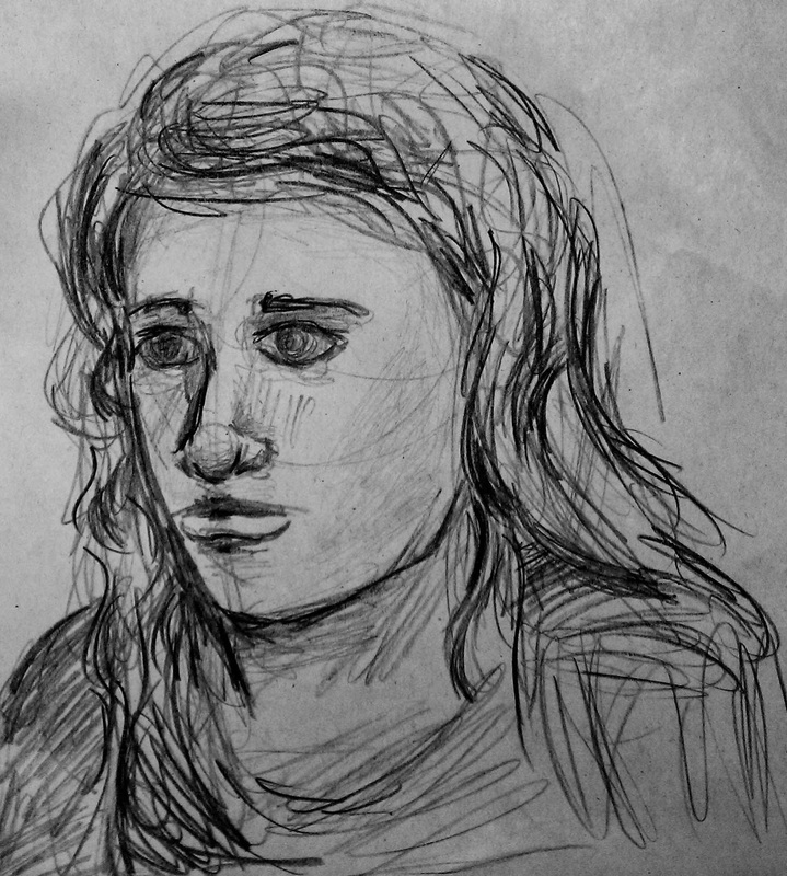
So today we worked on using lines to convey space and perspective, and with the last few minutes of class we had I sketched this. I tried to make the lines go in the direction of the hair, shoulders, and facial features to get that sense of movement. Obviously there isn't really any perspective to this, but I'm going to work on that tomorrow.
I had to start this one over a few times because I tend to "marry the details" a lot instead of capturing the general picture, and the point of this assignment was to not add too much detail. I still ended up adding some detail, but I don't think I over did it. Also, everything is proportional. I used burnt sienna and a little white for the background because I wanted it to be neutral and not take a lot away from the main subject.
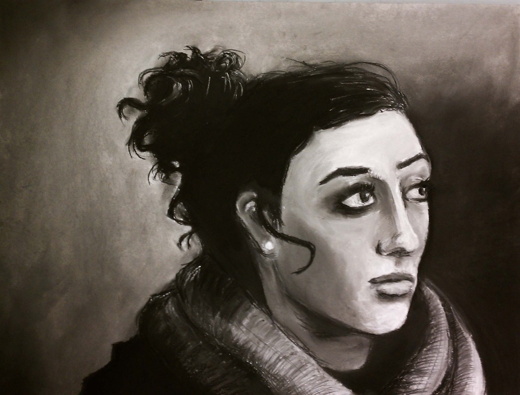
I'm very happy with how this turned out. I'm not one to use charcoal very often because it's really messy, but I'm really glad that I experimented with it. One thing I noticed about the charcoal is that you can really focus on value and not worry about colors and the rights hues. I thought that it would be really tedious to have to try and add whites back, but it works well to just go over the black with white chalk.
I really tried to focus on getting the big shapes and the general
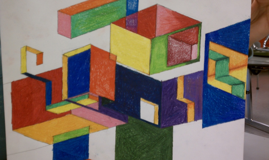
I had issues with this project just because I didn't really like the super bright colors that I got from the colored pencils. I tried two different types of colored pencils, and the woodless ones worked the best.
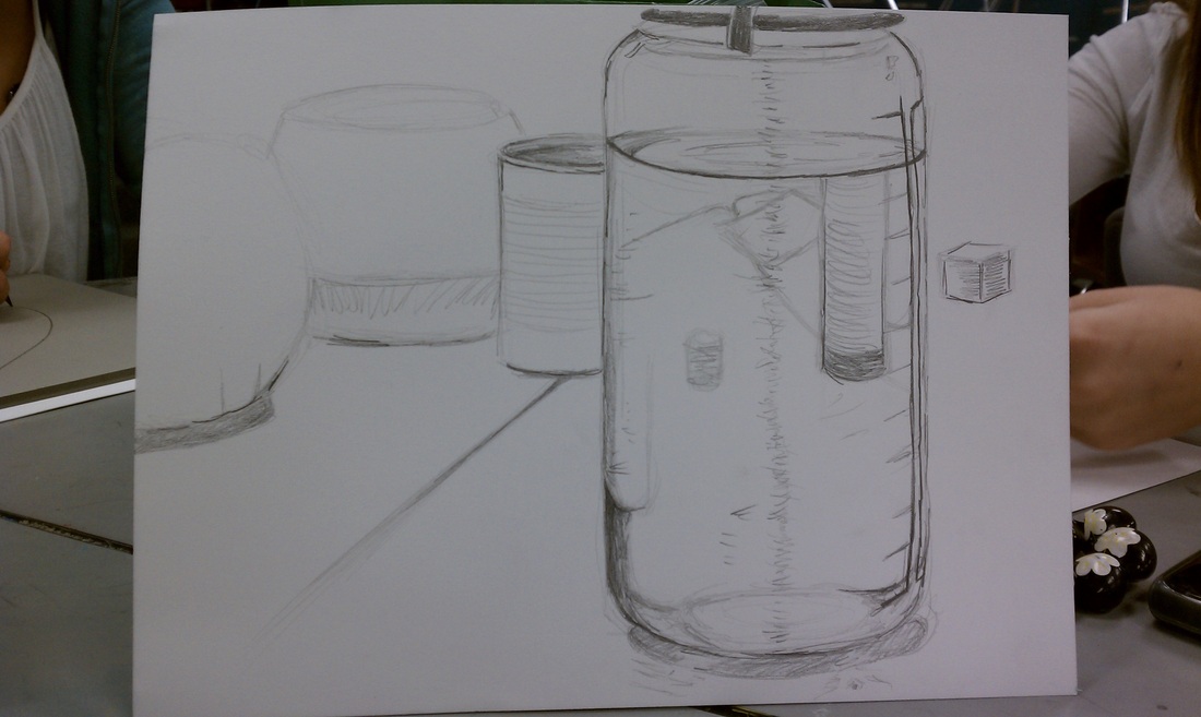
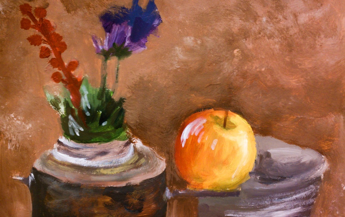
For this assignment I really wanted to do something more interesting than just drawing a couple of pots on a table, so I took the challenge of drawing my full water bottle and the rest of the scene from inside it. I like how it turned out because I really think I created space and showed depth well.