So this is still a WIP, and I finally think I know where I'm going with it.
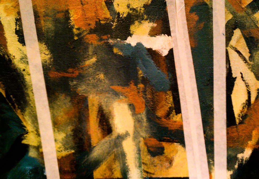
I painted a layer of sap green first, then put some masking tape over it. Then I painted a teal color with some highlights, put tape on it, then did the same with a golden kind of yellow and then a reddish brown. I took the tape off and there was way too much sap green, and it didn't go well with the rest of my color palet, so I painted teal over the green and then touched up the edges with the reddish brown and yellow.
So that is only the background, but I'm going to add a deer head in the center, and then have its neck and the rest of its body behind some of the other colors, giving the illusion that it's behind some tree branches.
To create space, I started with the darker colors in the back, and then worked my way up to lighter, contrasting colors.
My main goal with this was to play around and experiment with the different textures you can make with acrylic instead of just smoothing it out like oils.